
What the heck is colour contrast for accessibility and why do I need to care?
Before you get too attached to that new brand colours you’ve lovingly chosen, let me tell you my cautionary tale!
Ok, designer confession time: I’ve been working on my own rebrand for quite some time now. It has taken my so very long and I thought I’d nailed it, but recently I discovered I’d messed up a bit with one of my colour palette choices.
I’d set out my colour palette and was pretty happy with how the colours were going to work together and what each individual colour was going to do for me. On my website, I’ve chosen mainly dark blue and off white as neutral background colours, leaving baby pink, periwinkle, a minty green and a red as my colour pops for shout outs, roundels, icons and graphics. All very readable and high contrast.
Got too many colours to choose from? Read more about how to choose a brand colour palette that actually works for your business here.
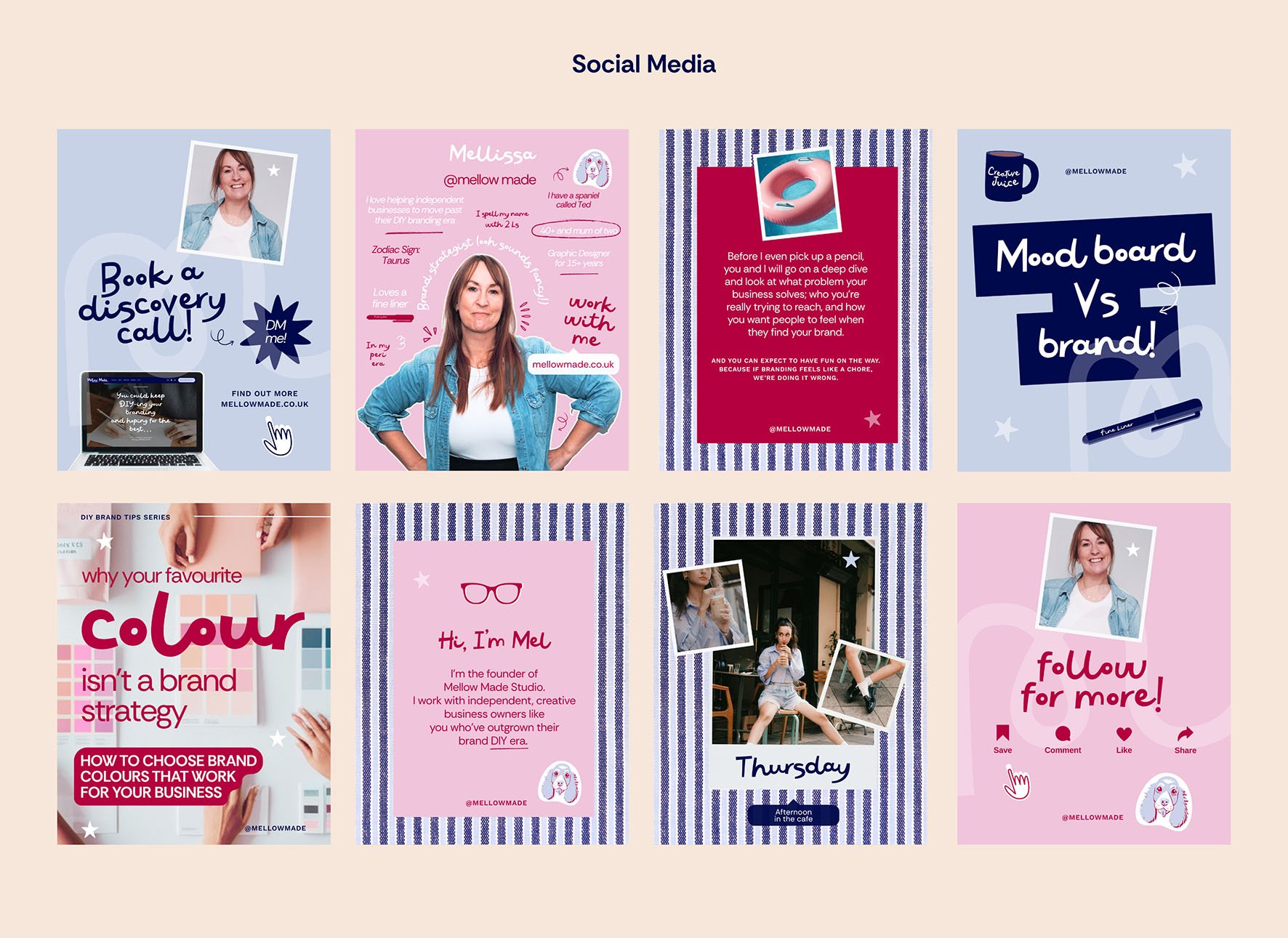
But the challenge came on social media. I wanted to create a feel that was a bit more playful whilst still remaining on brand. For some of my recent carousel posts I chose my red for a background with off white or pink text. Beautiful for large text, not so much for the smaller text. And it was only when seeing the posts actually on Instagram that I could see that, though readable, I wasn’t exactly making things easy for any potential clients or community members.
I headed over to Adobe’s Colour Contrast Checker to try out my red and pink combo and surprise, surprise, small text failed – shocker! But more on this later…
Why colour contrast for accessibility important
When we're talking about branding, we're especially interested in the contrast between things like text and its background or placing a graphic on a colour background.
If we think about white text on a pale pink background vs dark green text on a cream background; a button colour against a website background; your logo against different backgrounds or signs viewed from a distance.
Some combinations though pretty can actually be quite difficult to read, which is why testing your colours by creating social posts and other mock ups really matters.
Your colour palette can contain colours that don't meet contrast requirements for every use.
The important thing is knowing where and how to use them.
So much of your customer’s journey happens digitally often on a mobile phone. That’s your website; Instagram posts; emails; your online shop and booking forms etc. If the text is difficult to read, people may simply keep scrolling.
Also, the World Health Organization estimates that at least 2.2 billion people globally have a near or distance vision impairment. People can experience differences in colour vision, reduced contrast sensitivity, age-related changes in vision and a whole host of other things that can make certain colour combinations harder to distinguish.
Ask yourself if everyone who needs to read this can actually read it?
So how do you check if your colour palette would pass a colour contrast accessibility test
You don't need to become an accessibility expert before choosing your brand colours. There are tools that can do the complicated bit for you.
Google colour contrast for accessibility and you’ll find lots of free websites that will check your colour palette. I use Adobe’s Color Contrast Checker because it’s super easy to use plus has colour suggestions to help fix any issues.
It's much easier to tweak a colour when it's sitting in your palette than after you've built 37 Canva templates around it. Trust me, I know!
A colour palette needs to do lots of jobs within your branding suite
Now for the fun bit…
If you're currently putting together your own brand colours, here's what I'd do:
1, Choose your palette
Start with your primary, supporting, neutral and accent colours. Then decide what each colour is for: Which ones are backgrounds? Which ones are accents? Which colours might be used for text?
You’ll need one to three main or primary colours
These represent your brand and appear the most, on your logo and in your key graphics.
Supporting or secondary colours
A couple of colours that work with your primary ones. Use them across graphics, illustrations, packaging and other brand elements.
Accent colour(s)
for buttons, highlights, key information and those details you really want people to notice.
Neutral colours
You’ll need these for backgrounds to make sure your text is easy to read. You can use darker and lighter shades that complement your primary and secondary colours.
Then use a contrast checker to see how your combinations perform.
2, Test the combinations
Don't just look at coloured shapes next to one another. Put your colours into an actual social post; put a paragraph of text on a background colour; try a thank you card design for your packaging; make a market banner mock up; a website heading and a cta button. And do think about how both text and illustration colours will sit on your background colours.
Basically, see how your colours behave when they're actually doing their job.
Finally, don't assume that because you can read it, everyone can - this is probably my biggest takeaway. Your own eyesight isn't the accessibility test, so if something is just about readable, that's probably your cue to look for a stronger combination.
Happy colour hunting!
If DIYing your branding is turning into a bit of a headache tbh, reach out for a chat about how I can help, or email me at mel@mellowmade.co.uk
I share more branding tips especially for independent business owners over on Instagram.