Project: Logo & Brand Identity for Harbour & James Insurance
The Brief:
Project: Logo & Brand Identity for Harbour & James Insurance
Harbour & James Insurance is a UK-based insurance business providing clear, reliable cover for individuals and small businesses. The company focuses on trust, transparency, and personal service—removing the confusion and coldness often associated with insurance.
The brand should feel professional and credible, but also modern, human, and different from the typical “corporate blue” insurance brands.
Project Objectives
To create a confident, recognisable brand identity that:
Communicates trust, security, and expertise
Feels modern and premium, not generic
Sets the business apart from traditional insurers
Appeals to both personal and commercial customers
Key words: Secure, clear, dependable, human, refined
Visual Style Direction
The identity should be:
Clean and contemporary
Corporate, but with warmth
Should stand apart from the generic blue/grey/green seen often in the insurance industry
Design cues:
Subtle graphic motifs (anchors, lines, architecture, or abstract protection symbols)
Avoid clichés: no generic shields, swooshes, or stock icons

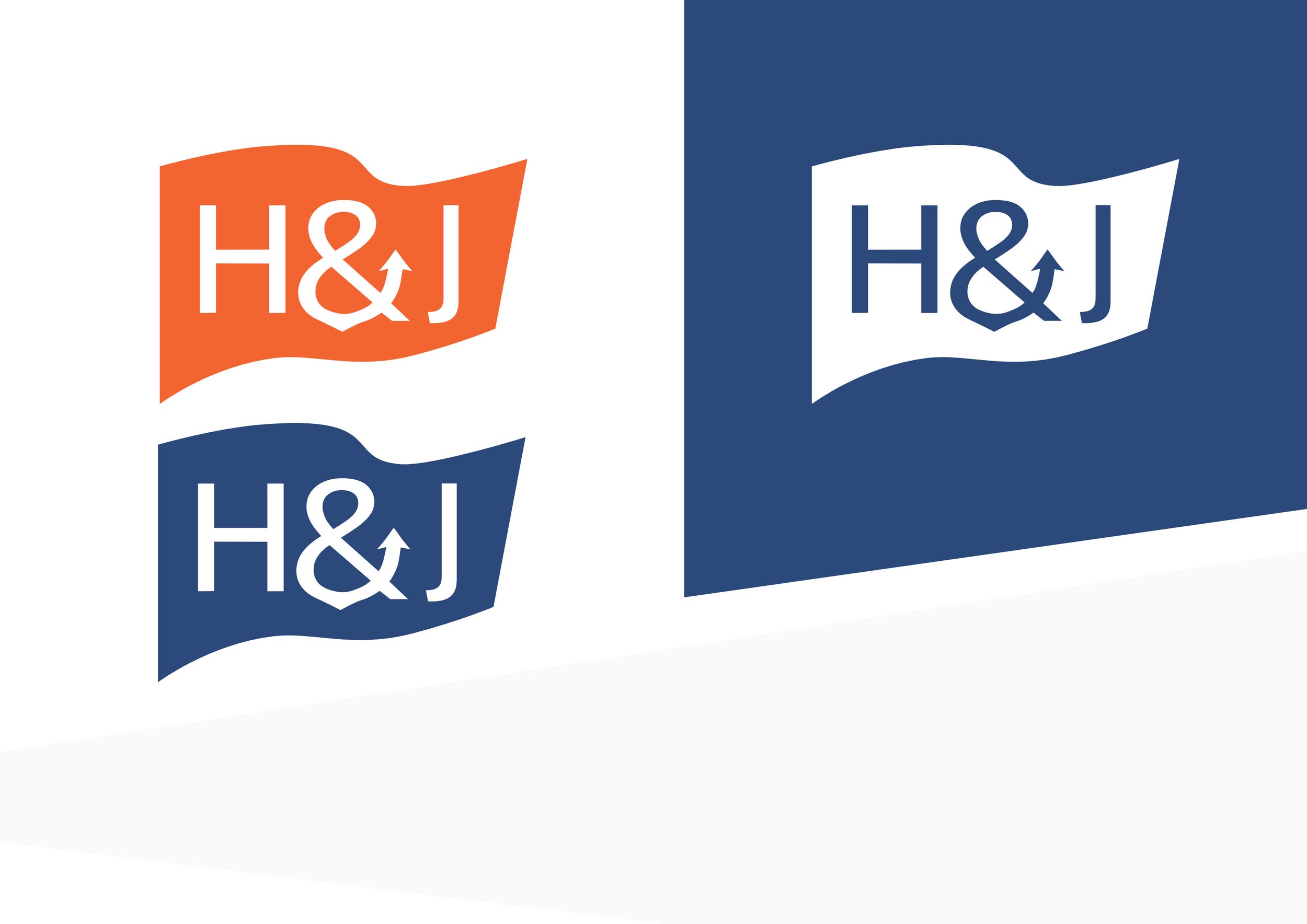
My Approach
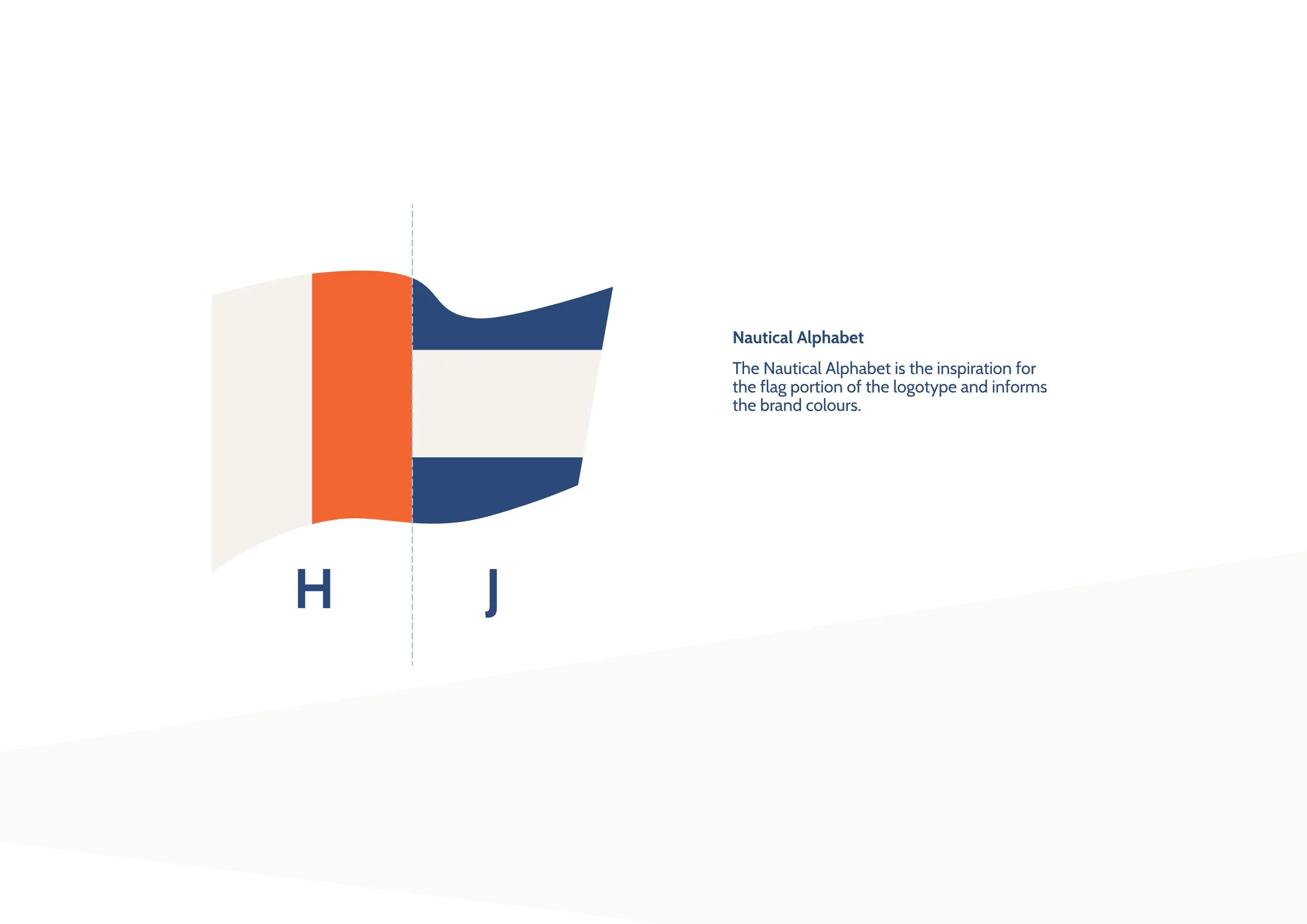
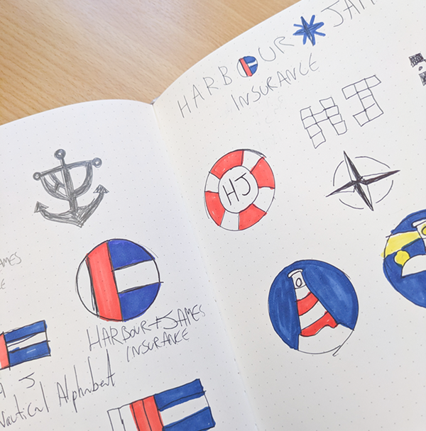
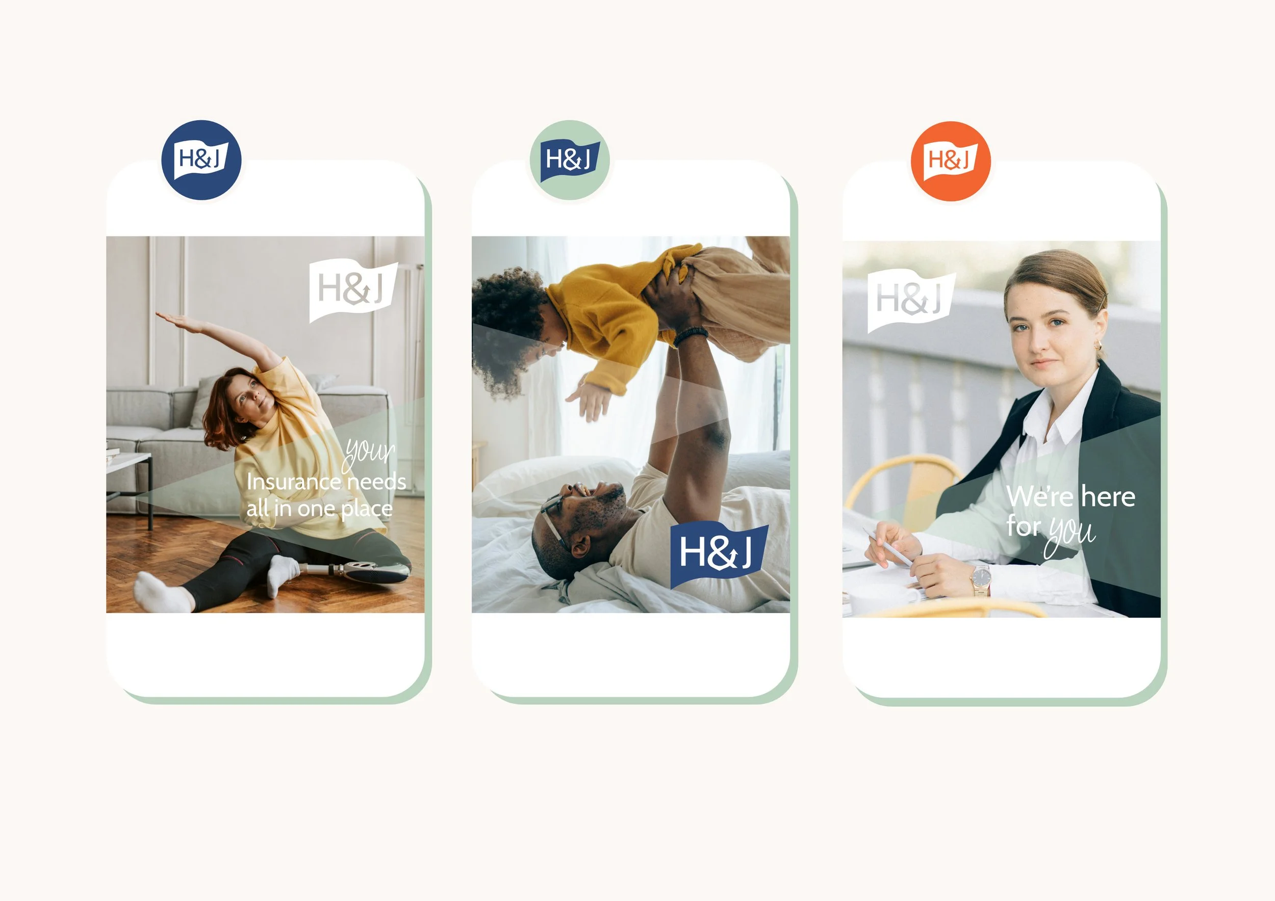
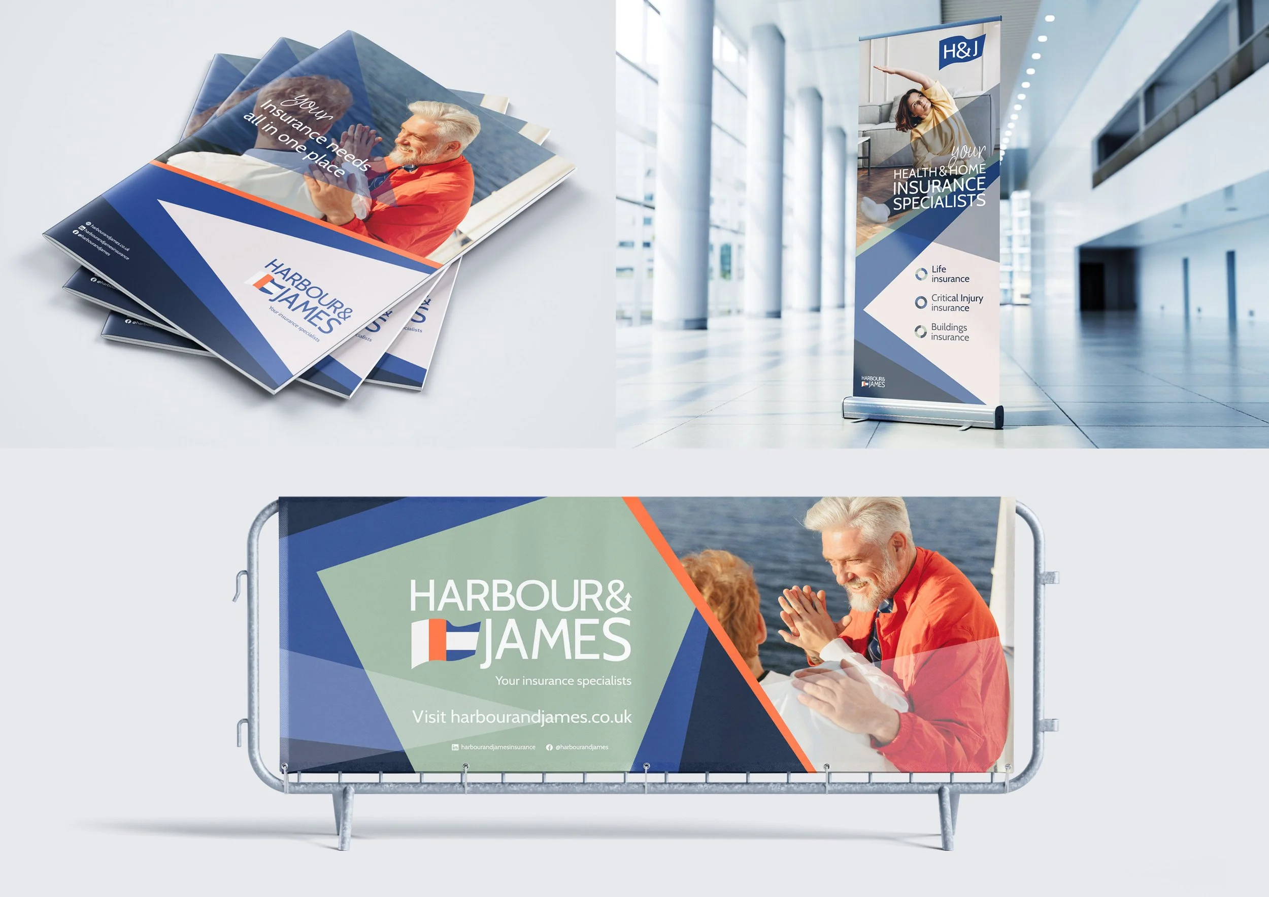
Taking cues from the company name Harbour & James as well as the brief calling for anchors, lines architecture as a starter for graphics, I worked up a logo suite based on nautical flags representing the H and J. I added a subtle anchor shape to the ampersand.