Project: Logo Redesign & Brand Identity for Britania Services
The Brief:
Project: Logo Redesign & Brand Identity for Britania Services
Britania Services is a family-run plumbing, heating and bathroom fitting company based in the West Midlands, UK.
This small business was initially looking for just a logo redesign as their current logo wasn’t scalable or really usable across the areas it was now needed. This business had been running on a logo only and needed a full logo suite, typography and colour palette, illustrations and brand guidelines. They wanted to keep elements that existing customers would recognise while creating a cleaner, more professional identity that would work across vans, uniforms, social media, signage and invoices etc.
Project Objectives
Keep branding recognisable to existing customers
Avoid basic spanners or flames within the main logo
Outside of the primary logo, create supporting graphic elements
Be simple but stand out from competitors
Key words: Professional, multi-skilled, reliable
Deliverables:
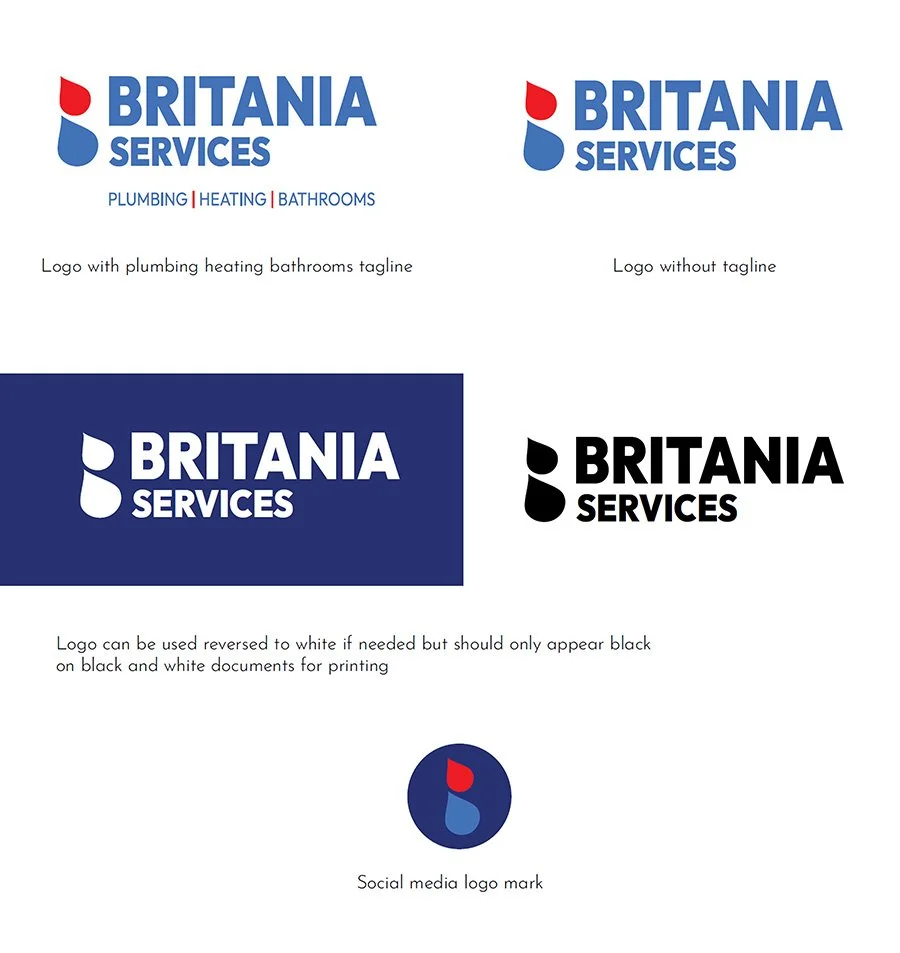
Primary logo, secondary logo, Icon/brand mark, monochrome version, horizontal and stacked layouts
Colour palette, typography recommendations, supporting icons
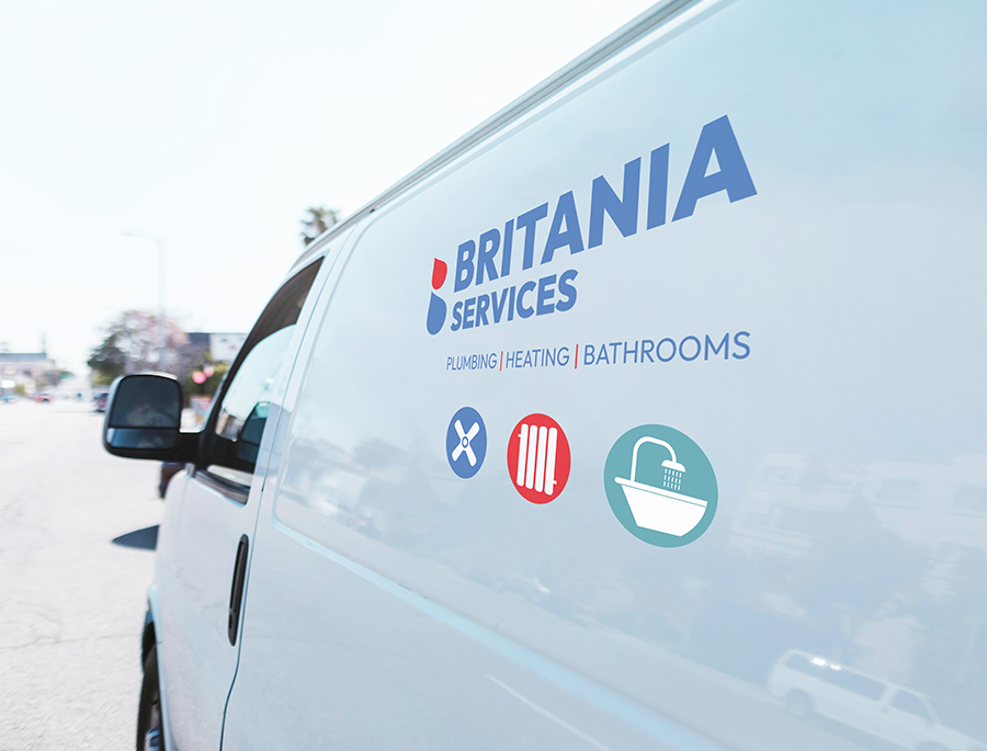
Vehicle livery concepts, workwear branding concepts
Brand guidelines
My Approach
The project began Britania wanted to create some workwear and their current logo wasn’t suitable. It hadn’t been created in the correct software and so wasn’t scalable or really very usable outside of printed invoices etc.
During my discovery call with Britania, we spoke about keeping elements from their original logo whilst recognising that it needed to move on. Although we initially met to talk just about a logo, it quickly became clear that a whole brand identity including supporting icons would be useful to the small team and we wrote the brief together from there.
I wanted to give them an identity that was clearly plumbing and heating but wasn’t a spanner, a single flame or quite text heavy which I saw a lot in my research.
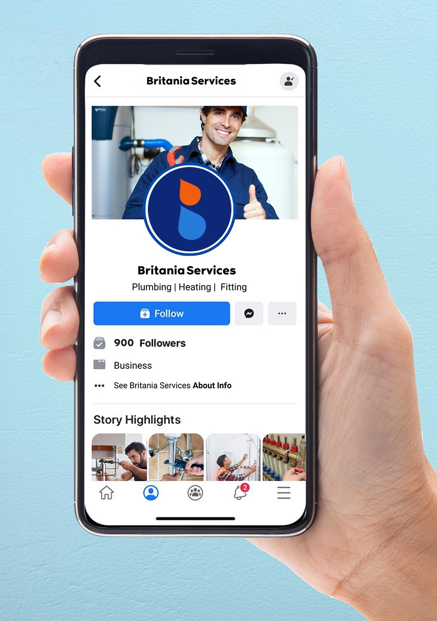
Of three proposals I put forward, the droplets within the B was chosen. It works well as both colour and monochrome and is complimented by the supporting icons. Overall, the branding gives Britania a lot of flexibility across the touchpoints where customers will find them.